5 Key Takeaways from Mobile eCommerce Shop Along Masterclass

Oliver Bradley, Global eCommerce Experience Design Director at Unilever, shared his insights from 10+ years of focusing on the digital shopping experience at the TMRE@Home event in a session titled, “It’s Not Just a Smartphone, It’s a Shopping Platform”. He focused on mobile user experience as it has become a major source of shopping and buying, but hasn’t had the same level of focus as the desktop experience. He recently started using the new Discuss.io Mobile Screen Sharing app and combined his experience with shopper UX with these sessions for the following key takeaways in his presentation.
5 Key Takeaways
#1 – Covid exposed the digital truth that many brands weren’t ready to win the mobile digital shelf.
Unilever has a huge stable of brands in the replenishment category – think brands like Dove, 7th Generation and Ben & Jerry’s. During the pandemic, online grocery sales doubled reaching 24% penetration of the UK market (Kantar, January 201).  A large segment of this growth was from the older generations that were forced into lock down and were not as comfortable with eCommerce. One of the biggest challenges with seniors and online shopping is that as we age, our eyesight get worse. Specifically, people over 50 struggle to read small details – double challenging on a small screen.
#2 – Covid 19 Accelerated the Shift to the Small Screen
Mobile device ownership increased AND time on mobile devices increased on the total and as and as a share of other devices. Mobile internet is now the #1 information platform in the US over desktop, TV, radio and newspapers. This trend emphasizes the importance of treating the small screen with focus to improve the shopping experience.
#3 – Mobile Shopping is Very Different than Desktop
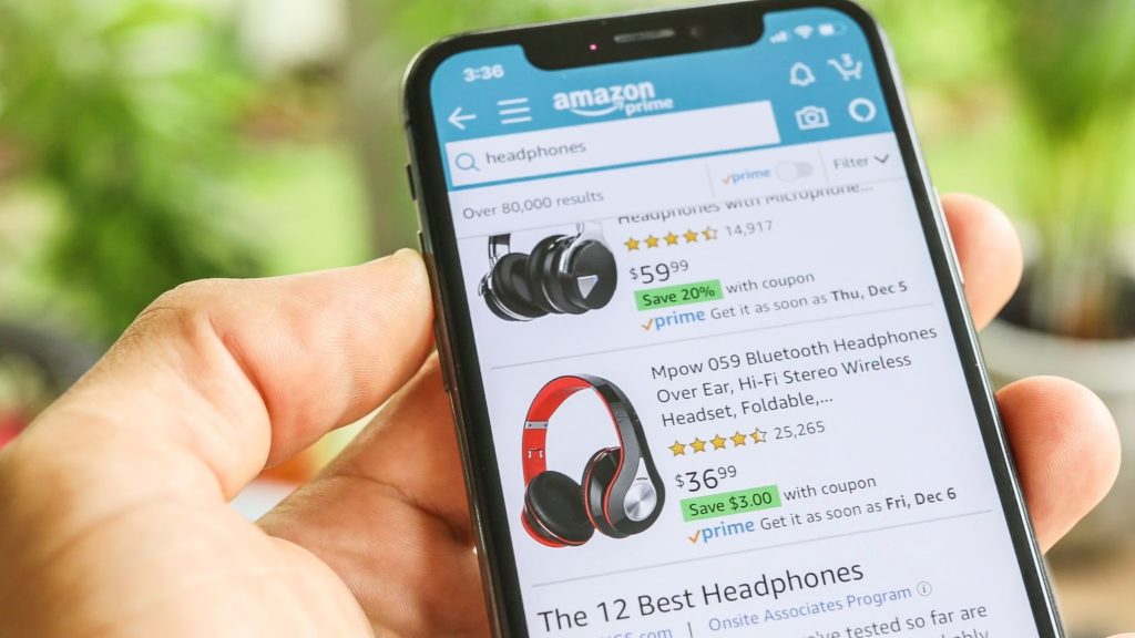
- People scroll faster (finger beats mouse). This means that visual elements are extremely important and need to communicate a lot of information in a quick view.
- People see MORE search results as they scroll faster. This means that the search results page is bigger so capturing the eye of the mobile user to stop and understand the product is extremely important.
- People avoid menus on mobile. Predictive search is primary navigation as it is faster so optimizations around titles and mobile search is critical.
- People do shorter sessions on mobile. The context of mobile shopping is very transactional and the user has an on-the-go use case which is quite unique from desktop.
- People refuse the “long read” on mobile. The small screen and lower contrast of text makes reading at any length more difficult which underlines the need for great visuals and clear, short text.
#4 – Biggest Mistake People Make (that they need help with) Is Relative Size of the Product.
Through qualitative research, Unilever has learned that the #1 mistake grocery shoppers make online is getting the wrong size. They may only want a single pack of something, but end up with a single pack that has 24 units in it. Or, may only want a small bottle, but end up with a jug because they look the same in the images with unclear sizing.
#5 – You Can’t Get This Type of Insight from Just Data – You Have to Talk to People While They are Shopping to Understand Frustrations and Behavior.
Retailers have a trove of data on shopping behavior, purchases and returns. They can layer on satisfaction data through surveys and a limited list of reasons for returns. But, to truly understand where the shopping session was successful or unsuccessful you have to observe the shopper while they are shopping and have that interaction of asking why they made this decision or didn’t click on that product.. The Mobile eCommerce Shop Along is a critical tool in the understanding of the consumer experience.
 The Mobile Screen Share app from Discuss.io provides an easy way to add the shoppers mobile screen to the live online conversation. You see and talk to the consumer in real-time while watching them tap and scroll their way around their mobile device – apps or websites. It allows for deeper interaction with the mobile shopper, hear from them what is readable, what is hard to understand and what is helpful.
Oli goes deeper into these points and answers some key questions from the audience during the session. You can watch the full video and see all of the slides here. It was truly a master class in thinking about the mobile shopping experience from the shoppers perspective – thank you Oli!
Sign Up for our Newsletter
Related Articles

6 Mobile UX Research Challenges and How to Solve Them
As a relative newcomer in the marketing research world, mobile UX qualitative research can be tricky to perfect. The challenges…
As a relative newcomer in the marketing research world, mobile UX qualitative research can be tricky to perfect. The challenges…
Mobile Screen Sharing for Competitor Research
It was the ancient Greeks who coined the expression “know thyself,” wise words for any entrepreneur. Remarkably, at nearly the…
It was the ancient Greeks who coined the expression “know thyself,” wise words for any entrepreneur. Remarkably, at nearly the…

Mobile UX Research for Agile Product Prototyping and Development
In a mobile-first world, it is increasingly difficult to create mobile apps or websites that can deliver seamless experiences to…
In a mobile-first world, it is increasingly difficult to create mobile apps or websites that can deliver seamless experiences to…

